
 It is no secret that having a functional and highly intuitive website is crucial to the success of your business. This doesn’t just mean providing accurate and detailed information: Your website has to look good, grab your customers’ attention, and make it easy for them to use and navigate.
One of your primary considerations while revamping or updating your website is to make the experience seamless, intuitive, and simple for your customers to navigate. Get them to the point quickly without too many distractions or diversions. Attention spans are short, and if a customer is confused by your website or has to click through too many pages of content to get to the information they are looking for, chances are they will quickly become impatient. You want to draw them in, not put them off with a bad design or a slow, clunky site. Your website needs to communicate your brand values and what makes you different from your competitors as well as the industry disrupters and aggregators in a seamless, natural way. You want to offer them a site that works easily on all their various devices, from smartphones to tablets and everything in between. That’s a lot to communicate with one site, right?
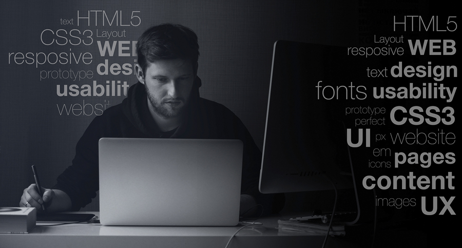
This is what is referred to in the industry as UI (User Interface) design. It boils down to all the aspects of design that make the user experience as flawless, attractive, and functional as possible.
So what should you be looking out for? What are the UI design elements you need to have built into your website right now? Here is a guide to the top “must haves” that will help your site better engage your customers and turn web traffic into real bookings.
1. Eye-Catching Typography
Bold, statement-making typography is an essential element of great UI design. It should be one of the key features that you spend a good amount of time planning and making sure it is just right. Pay attention to readability, and pick appropriate fonts that communicate your message and reflect your brand. Focus on how easy it is to scan the information presented, and use appropriate fonts and simple wording to quickly grab your customers’ attention.
Typography Hit: bricedarmon.com
There are single, bold words written in a very large, attractive font that is also used for the photographer’s name and elsewhere across the site to maintain brand consistency. As you scroll downward, more words appear over related background images. There is not much “information” presented, but the text gives a sense of intrigue, playfulness, and creativity, encouraging the user to interact with the site and discover more. The site is clean and sleek.
Typography Miss: ikea.com/us/en
The home page is far too busy, with too much text, small headings that are not easily distinguishable from one another, and an unremarkable, standard font. Bad use of typography like this can be off-putting for the user who feels immediately overwhelmed by “too much information” that is not visually appealing. Moreover, it goes against the company’s own branding of being stark and minimalist.
2. Split-Screen Design
This kind of interface allows your website designer to get creative, playing with different colors and thematic elements while keeping a consistently branded look. It is a great way to present two different options as it allows for a quick comparison while also emphasizing uniformity and an equal level of importance. For example, you could have one screen that supplies information on a variety of different services you offer, each given equal screen presence without the need for scrolling. This type of design can also be used to make the distinction between different pieces of information as obvious as possible and can be particularly useful in the context of mobile web design, too.
Split-Screen Hit: fedex.com/en-us
The homepage presents different options boldly and clearly at the top of the screen across a single background image. The customer clearly sees their options: rate, track, or ship. It gets right to the point.
3. A Bold Background Image
You may have noticed a lot of websites using this technique. Even if you are not an expert in web design, it is easy to spot these eye-catching design elements, demonstrating what makes them so effective. A striking image sets the tone for your website immediately, and the customer can get a good idea of your brand and service offering before even reading a word. Using the right kind of image in this way is both visually and emotionally appealing, and can be a highly effective tool. The old adage that a picture speaks a thousand words is still highly relevant in the world of contemporary UI web design.
Bold Image Hit: fedex.com/en-us
FedEx’s website also makes good use of this design element, with a single, seasonally themed image creating a clean, crisp, and appealing background that allows the other information on the home page to pop.
4. Smart Use of Color
Color is another way that designers can play with the visuals of your website to create impact. Vibrant, bold colors are being used more and more regularly, with designers looking to make a unique statement with clever color palettes to deliver brand messaging. Use of color also allows you to distinguish easily between different sections of your website or services offered without the need for textual explanation. Just watch out for overuse: Just because a diverse palette can be used, it doesn’t mean it should be. Sometimes, simple is better. Depending on what message you are trying to communicate through your website, one bold color choice may be all that is necessary. This doesn’t have to mean vibrant, either—darker color choices, including black and white imaging, are also seeing a resurgence in current web design. Colors can convey all kinds of meanings to customers, so make sure you are selecting yours with thought and attention.
Color Hit: hubspot.com
Marketing specialists HubSpot use color extremely effectively throughout the site. Colors are used to distinguish between different sections and pieces of information, with bold background color blocks also used to great effect. While different colors are used effectively, a complementary color palette appears consistently across the entire site to maintain appealing visuals and a strong brand identity.
5. Unique Illustrations
Custom illustrations have been a huge trend in UI web design for some time and it looks to be something that will continue, at least for the foreseeable future. By adding simple, original illustrations to your website, you can more effectively communicate complicated, lengthy content into a more easily digestible format, making the user experience faster and more enjoyable. Customers can easily navigate your pages to find the content they are interested in by quickly scanning these images without having to take a deep-dive into details that they are not interested in. The use of illustrations makes website navigation more intuitive and a much less frustrating process for the customer who may otherwise become overwhelmed with the sheer volume of the information you are providing.
6. Storytelling With These Illustrations
Storytelling, whether on social media or your website, is enhanced by turning these custom illustrations into a story for a more engaging user experience. This means that the images appear throughout the website, helping to set the tone, present your unique benefits, and communicate your message in a “voice” that is easily relatable and uniform. This type of illustrative storytelling brings originality and dynamics to your website and allows the customer to clearly follow a well-defined process and consistent branding. For example, these illustrations could be used to represent different services offered, and to quickly communicate the benefits to customers via individual yet similarly illustrated pages.
Storytelling Hit: hubspot.com
HubSpot also uses custom illustrations and storytelling to great effect. The illustration at the top of the homepage clearly outlines what they offer to their clients, showing the path from starting up a business in the garage to working in shiny new offices with numerous employees. This helps the customer easily picture how HubSpot can help them get where they want to be, which wouldn’t be as engaging or interesting with tons of text.
 7. Animation
This needn’t be full-on video animation embedded throughout your site, but can simply mean adding elements of movement to enhance your user’s experience and make information clearer. For example, you could use buttons, switches, toggles, or other interactive elements to create a more streamlined website navigation process. This increases visual appeal for the customer and helps to enforce a much more effective and positive experience as well as reinforcing a strong, attractive brand image. Although animation can be highly effective, don’t go overboard.
Animation Hit: bricedarmon.com
Brice Darmon’s website provides a great example of highly effective animation, with numerous background images cascading as the user scrolls the page, creating a fun, dynamic experience. HubSpot uses animation more simply—there is a slight pop forward as the user hovers their mouse over a section box. This is a very subtle touch, but it helps to create the strong visual appeal that draws the user into the website.
Animation Miss: ladygaga.com
The singer’s website incorporates scrolling banners and sidebars, GIF animations, electric colors, and a moving signature for visual overload. This may work for the bold and eccentric singer, but has no place in a business website.
As these trends continue to evolve, keep in mind that what works best for your customer may be very different than your competitors’ websites. Don’t be afraid to NOT look like every other chauffeured transportation website. Play to your strengths and concentrate on how you can improve the experience of your users while they are there. You spend time and money driving traffic to your site, so you need to be sure it is as attractive and user-friendly as possible in order to keep current customers coming back and to help convert those who visit for the first time. Adapting your website to take advantage of these latest trends will go a long way in helping you to achieve just that.
A word of warning: a great UI is only one piece of a successful website, and while it is extremely important in providing a valuable experience for your users, it is crucial to remember that your website should be achieving multiple goals, including getting visitors to your site from search engines. Your website should be treated as the foundation of all your marketing efforts. So, take the time and make the effort to make your website effective on multiple levels. Remember, it is rarely just about a “pretty face” when you are trying to build relationships.
[CD0119]
Aurel Dumitrescu is the chief technology officer for DriveProfit. He may be reached at aurel@driveprofit.com.